Raymond Chen’s The Old New Thing: Practical Development Throughout the Evolution of Windows is a must read for anyone creating software that interacts with users. Chen was one of the developers of Windows 95 and the surface reason his book is provocative and interesting is because it exposes a lot of the thinking behind the Windows UI and answers questions that bug people, such as “why do you press the Start button to stop the computer”?
The more compelling usefulness of the book, however, is Chen’s deep experience with how users respond to the user interface. I recently remarked about how a dialog box on the United Parcel Service web site probably is ignored by most users. Chen explains why. In the first chapter of his book, he has the following priceless mock dialog that shows what a user perceives when a dialog interrupts their work:
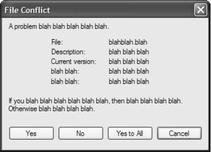 <
<
Chen does not point this out to make fun of users. As he puts it, the problem is that “all the user wants to do is surf the web and send emails to their grandchildren.” The dialog is in the way of that, so it gets swatted away like an annoying fly.
This is a blow to the pride of many developers, who easily forget that their software is not the center of its user’s universe. It is simply a tool, a means to an end.
Developers throw up dialogs because it’s generally easier to let users make decisions than to figure out what needs to be done at a given moment. It is also easier than designing software that is forgiving, resourceful and resilient.
In my original story, I explained that if a UPS shipper specifies a shipment value over some threshold amount, a dialog appears explaining in some detail that because of the shipment’s high value they must obtain an acceptance signature for the shipment from an actual UPS employee. If the shipper doesn’t do this, any loss claims will be invalid. I opined that most users will never register this info, will swat the dialog aside, and buy worthless insurance.
How might this have been better implemented? I would have put it right in the workflow of the wizard that was managing the shipment, rather than interrupt with a notification and an OK button. Then I would give them the choice of reducing the valuation, requesting a pickup, or locating a company store to drop off at — all without losing the context of what they are working on, mysteriously completing the shipment, or otherwise doing anything unexpected. In this case, I’d require more decisions from the user, because it’s the only way to insure they are not just throwing money down a hole.
In most cases, though, it’s better to take some reasonable default action and say nothing at all. For example, usually if a users closes an open document without saving, they meant to save the changes up to that point, so at the very least, the default choice, if you present one at all, should be to save the changes. Instead what we see in most applications is a dangerous default such as not saving changes, or backwards questions that ask if you want to discard changes rather than keep them. Remember, the user isn’t really reading this, so if they just hit the Enter key you probably should err on the side of caution, and not risk throwing away the last forty minutes of work.
Come to think of it, this is why auto save features were probably born; I have long been in the habit of saving my work every minute or two but not all users have that healthy paranoia; a configurable auto-save feature, turned on by default, does that for them.
Users usually don’t want all the nifty choices we think to offer them. Often, these choices cause more harm than good. They should be absent, or hidden behind some kind of “expert” mode.
Think through the features in your user interaction and make them as free of “friction” and fluff and endless choices as you can. Let the user get the critical path of their work done with ease. Save your “interruption capital” for those times when there is something the user truly neeeds to stop and make a decision about … a decision that matters to the user.

{ 1 comment… read it below or add one }
-For example, usually if a users closes an open document without saving, they meant to save the changes up to that point, so at the very least, the default choice, if you present one at all, should be to save the changes. –
That is a bad assumption to make. Imagine if every program you used saved the changes you made to a document by default. No notification or question, just a save.
It would be like your car automaticly locking it’s doors when you closed a door. It causes more problems then it solves.
Bob responds: It depends on the software and in some cases, the context of usage. I think it might be a lousy default for a text editor, for instance, because of the kinds of users who would use a text editor and the kinds of jobs they would typically do with it. Text editors get used by people with a clear mental picture of the files they are manipulating, and who may typically make experimental changes they want to commit to disk deliberately.
But for a general purpose word processor? Most of them auto-save by default every few minutes anyway, and there is a reason for that. Most users want to be protected from data loss and expect what they type to be saved. For them it’s just an annoyance to ask them about it, and causes far more problems to leave their work unsaved than to save it for them. Users are much more likely to call tech support because of lost work than because they want to revert to a previous version. Reverting to a previous version wouldn’t even occur to most of them, aside from the more advanced ones that might use some sort of undo feature within the editor.
The audience for this blog is, for the most part, the most computer-literate of users. We’re used to control and choice. That can still be configurable for us. But as a default, I think most users want less choice rather than more, even if they can’t articulate it that way.